
Currently, only two methods exist to ensure your website appears appropriately on diverse devices. This is a responsive and adaptive design. With a responsive design, the website can modify its layout and appearance depending on the device’s screen size, whether a large desktop computer or a small mobile phone.
However, a responsive design necessitates the creation of a distinct layout for each device that will be used to access the website. We won’t discuss responsive design since it requires significant resources to develop and maintain, which only large companies like Amazon can afford. We will talk about responsive design and why it is so important nowadays.
With a responsive design, your website can effectively handle various problems. Making your website mobile-friendly will enhance its appearance on large and small screens, extending visitor attention. Improving your rankings in search engines is another benefit that it can get from a responsive design.
Discover the significance of responsive design for your business website and the advantages and disadvantages you must know before committing to a redesign. Keep reading to learn more.
What is responsive design?
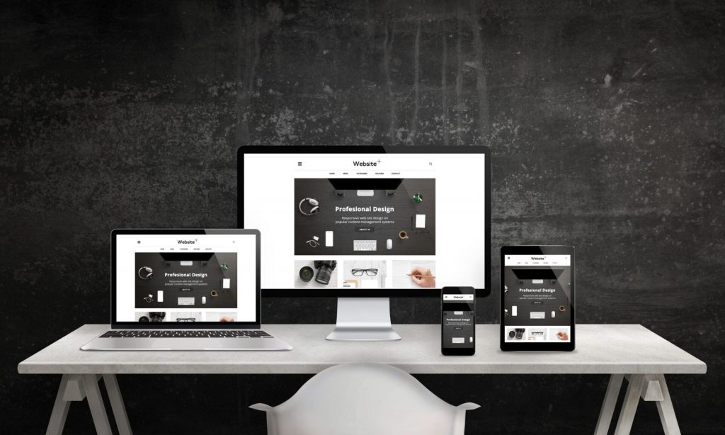
Before we proceed, let me explain the responsive design concisely and delve into its workings in greater detail than our previous description. Responsive design involves developing a website that adapts its elements and content to fit the screen size on which it is viewed. Thus, the images only extend to the screen’s width, and visitors on mobile devices do not need to make extra effort to read the content.
Responsive design primarily aims to remove the necessity for resizing, scrolling, zooming, or panning on websites that need to be optimized for various devices. Navigating such sites can be challenging and might even cause you to lose potential customers who get frustrated with figuring out how to accomplish something.
There’s no more reason to develop a separate website for smartphone users while using a responsive website design. Instead of designing several sites for various screen sizes, you can create a single website that automatically adapts to the device it’s being viewed on, no matter if it’s scaling up or down.

Why should you invest in responsive design?
We reside in a society where multiple screens are prevalent. Therefore, your website must be accessible on various devices, as you cannot predict which device a viewer might use to browse your site.
As responsive website statistics suggest, it is recommended to cater to desktop and mobile viewers when designing a website. The number of viewers on mobile devices has exceeded the number of viewers on desktops, and this tendency is expected to continue as smartphone usage becomes more widespread in the modern world.
In early 2015, Google announced that a mobile-friendly website would affect its search engine rankings. That meant websites not optimized for mobile devices would receive a lower ranking, as they would not provide a good user experience for mobile searchers and viewers.
To summarize, opting for a responsive design for your website offers several advantages, such as:
- Affordability
- Flexibility
- Improved user experience
- Benefits of search engine optimization
- Managing is easy
We will examine each of the five benefits in more detail to help you understand why investing in a responsive website is wise.
- Affordability
It can be costly to maintain different websites for mobile and non-mobile users. However, you can save money by utilizing a responsive design that allows you to have a single website design that caters to all visitors and devices without needing a separate mobile site.
- Flexibility
Having a website with a responsive design allows quick and easy to make changes without worrying about updating multiple sites. This flexibility is especially advantageous for making small design adjustments or correcting typos, as changes only need to be made once.
- Improved user experience
As a website owner, it’s crucial to prioritize user experience. You want your site to be pleasant and easy to use, encouraging visitors to return. Imagine someone visiting your site from a mobile device, and it loads too long, or your images need to be more transparent. That can harm your business as no one wants to work with an amateur company. However, responsive design can significantly improve user experience and encourage visitors to give your company a chance. With responsive design, visitors won’t have to zoom or scroll, allowing them to view your content and make a positive impression quickly.
- Benefits of search engine optimization
There are a lot of companies that use search engine optimization (SEO) to improve their Google search page rankings. Getting closer to the top enhances the likelihood that potential customers will find you. Responsive design is helpful for SEO, as Google favours mobile-friendly websites. In addition to other SEO strategies, responsiveness can significantly improve your search engine results.
- Managing is easy
For smaller businesses, time is often limited when updating their website’s appearance. Hiring a designer to work with all aspects of the website can be expensive and time-consuming. Responsive design makes it easy for you to make changes quickly and efficiently. With only one website, your marketing efforts become much more straightforward. You won’t have to worry about which site to link in social media updates or whether all redirect links work correctly. Responsiveness reduces the stress of managing a business website.
Is responsive design worth the hype?
It’s important to note that no marketing method or design type is flawless, and responsive design is no exception. There are some downsides to responsive design, such as:
- It is possible for certain websites to only look good on select devices. However, working with experts such as Dhyanvi Technologies should be fine.
- Suppose you want to provide varying options to users based on their devices. In that case, doing so on responsive websites can be challenging.
- Resized advertisements or banner ads may cause issues for you.
Although every design has its drawbacks, this also applies to responsive websites. However, most statistics on responsive websites prove this is the most effective approach. A significant number of mobile users, 61%, will leave a website immediately if they need access to the information they need or if the website takes too long to load. Despite its disadvantages, most internet users prefer responsive design, as it dramatically simplifies the mobile browsing process.
It is recommended to adopt your website with a responsive design.
If the success stories of responsive websites do not convince you, consider the cost and time savings they can provide. Responsive design is regarded as one of the crucial aspects of modern web strategy and should be a part of your own. If you’re ready to invest in a responsive website, explore our responsive design page and web design calculator to learn about the costs and additional benefits. You can also contact the design experts at Dhyanvi Technologies for a free, personalized quote to make your site responsive.